Measure Properties

Colors

Set the colors for the background and header of a column, as well as the font color of the header.

Suppress column in sidebar

Choose this option if you wish to hide the column from the sidebar. This comes in handy when you have columns in your data that you need for SuperTables calculations but don’t want to show in your SuperTable. Using this option never allows your dashboard users to add the column to SuperTables using the Sidebar.

Suppress header name

Ticking this will remove the column header from the SuperTable view.

Suppress Filter

Suppress the filter from a specific dimension. You see in our example it’s not possible to filter on Category but possible on Sub-Category.

Suppress Total

Suppress the column from showing total value. For instance you want to show the Sales total but not the quantity total in the total row of a grouped SuperTable, suppress the total from your quantity column.

Show aggregated value when grouping

Turn off aggregated values (SUM, AVG, MAX etc.) if you do not wish to see it in your view.

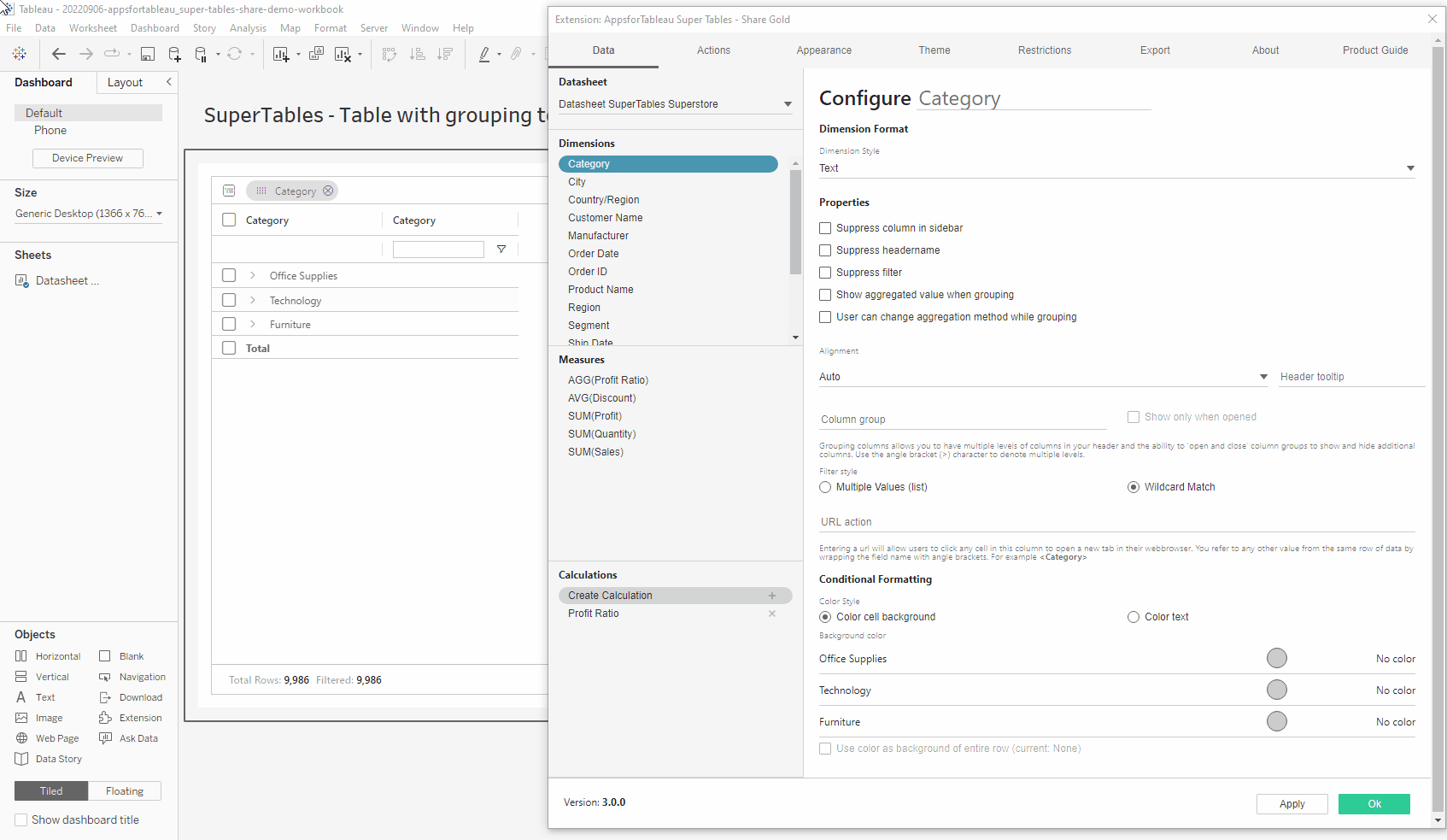
User can change aggregation method while grouping

Dashboard creators are able to restrict users to only aggregating to their chosen aggregation method.

Aggregation Method

Using the hamburger menu alongside a column allows you to change the column aggregation (change from SUM to AVG for instance).

Truncate Values

Truncate the measure to show a range by deciding on a minimum and maximum value.

Default Aggregation When Grouping

Use the dropdown to choose which aggregation will be used on your measure when grouping / aggregating your measure in SuperTables. Many options available now including the much requested CountD. This incredible new feature lets you calculate the unique amount of members in a dimension and show this in your SuperTables. You can use this in calculations to add even more value to your table.

Alignment

Choose the alignment of the text within your SuperTables view, as well as the header of the specific column.

Header Tooltip

Change the tooltip of your selected dimension. By default, it will show the measure name. This tooltip is for the column header only

Column Grouping

Add an extra header and add all dimensions, measures and calculated fields of your choice to this extra header group. Create a unique group within your SuperTable. You can indicate if a column must only be visible when the column group is expanded or also when the column group is not expanded. This way, you can create a group with extra detail but not show all detail on the initial opening of the dashboard.

Needs a screenshot, was a bit hard to find what it was refering to

URL Action

Entering a URL will allow users to click any cell in this column to open a new tab in their web browser. You can refer to any other value from the same row of data by wrapping the field name with angle brackets. You can of course also use a dynamically calculated field that contains a dynamic URL based on the content of that specific row of data. With this, you can set URL parameters to open a dashboard that has already been filtered on specific column values in your selection.

Conditional Formating

With this option, you can set conditional formatting. There are three options for conditional formatting:

  1. Change the font color of the cell

  2. Change the background color of the cell

  3. Change the background color of the entire row

Background Color

Click on the circle to open the color palette and choose the color you wish to use. Please note that you cannot configure colors for a dimension with more than 50 members.

Gradient

Instead of having set colors for below bound, in bound and above bound, it will gradient from below to above. Use the lower & upper bound to decide on the scope.

Show Background As A Bar Chart

Change your cell into a bar chart, setting the minimum and maximum bounds.

User Color As Background Of Entire Row

Fill entire rows in your SuperTable by using the conditionally formatted colours of your upper and lower bounds.

Last updated