
Waterfall Chart
A waterfall chart is a form of data visualization that helps in understanding the cumulative effect of sequentially introduced positive or negative values. These intermediate values can either be time based or category based. The waterfall chart is also known as a flying bricks chart or Mario chart due to the apparent suspension of columns (bricks) in mid-air. Often in finance, it will be referred to as a bridge.
A waterfall chart can be used for analytical purposes, especially for understanding or explaining the gradual transition in the quantitative value of an entity that is subjected to increment or decrement. Often, a waterfall or cascade chart is used to show changes in revenue or profit between two time periods.
Possible Use Cases for Waterfall Chart
Data structure & requirements
The data structure needed for each use case is described in the following section: **Data Structure
Aggregate First category
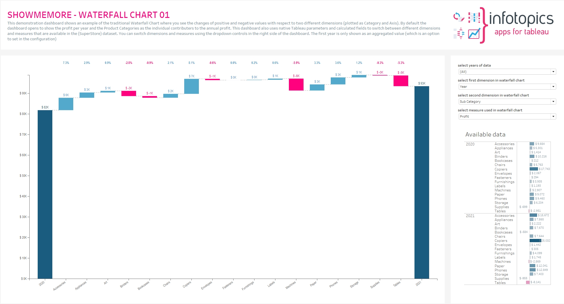
Compare the differences in sales, per dimension, to the previous year. Our viz is comparing all product categories sales from one year to the previous year. The size of the bars within the Waterfall Chart represent the value difference from the previous year. We have colored the bars to show whether it is positive or negative with respect to the previous years sales. This will show which category has had the best growth as well as showing which categories contributed less to current year sales.
Comparison
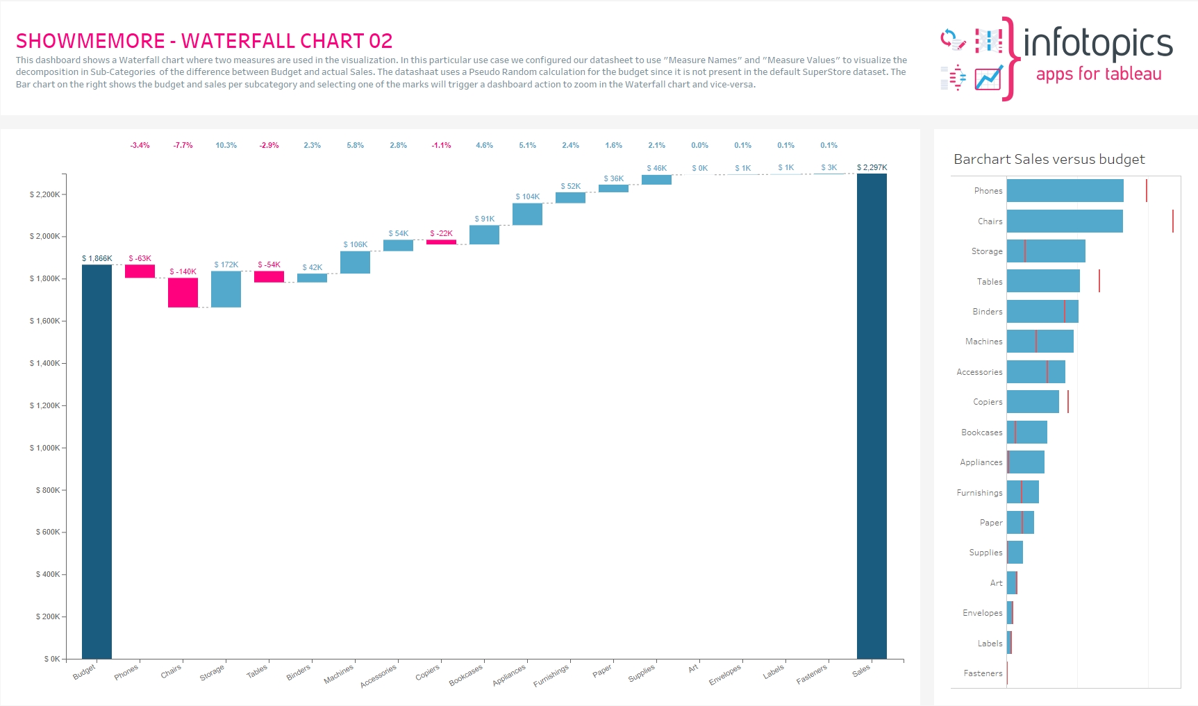
This dashboard shows a Waterfall chart where two measures are used in the visualization. In this particular use case, we configured our datasheet to use “Measure Names” and “Measure Values” to visualize the decomposition in product categories of the difference between Budget and actual Sales. The graph shows the contribution of each product category to the actual sales with respect to the budget (over budget is in blue, under budget is in pink)
Subtotal
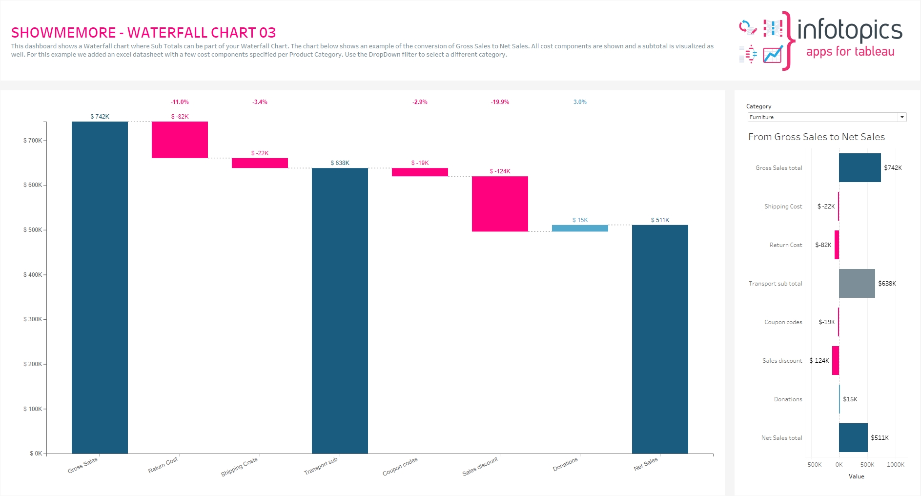
This dashboard shows a Waterfall chart where Sub Totals can be part of your Waterfall Chart. The chart below shows an example of the conversion of Gross Sales to Net Sales. All cost components are shown, and a subtotal of transport (shipping and return) costs is visualized as well.
Waterfall Charts are highly customizable follow one of the pages to customize specifics aspects of the diagram:
Last updated