ShowMeMore
WebsiteAll products
  • Introduction
    • Getting started with ShowMeMore
      • Guide to the first VizExtension
      • Getting started with dashboard extension
  • Visualization Types
  • Sankey Diagram
    • Data strucuture
    • Configuration Screen
    • Format
    • Color formatting
      • Text and background
      • Color Nodes
      • Color Links
    • Text formatting
      • Labels
      • Tooltips
      • Measures
    • Legend
    • Dashboard Actions
  • Source Target Sankey Diagram
    • Data strucuture
    • Configuration Screen
    • Format
    • Color formatting
      • Text and background
      • Color Nodes
      • Color Links
    • Text formatting
      • Labels
      • Tooltips
      • Measures
    • Dashboard Actions
  • Waterfall Chart
    • Data structure
    • Configuration Screen
    • Format
    • Labels
    • Measures
    • Color
    • Dashboard Actions
  • Geo Sankey Diagram
    • Data structure
    • Configuration Screen
    • Format
    • Tooltips
    • Labels
    • Dashboard Actions
    • Color
  • Network Diagram 2.0
    • Data structure
    • Configuration Screen
    • Analytics Options
    • Labels
    • Tooltip
    • Measures
    • Color
    • Format
    • Dashboard Actions
  • Radar Chart
    • Data structure
    • Configuration Screen
    • Format
    • Labels
    • Tooltips
    • Measures
    • Color
    • Legend
    • Dashboard Actions
  • Venn Diagram
    • Data structure
    • Configuration Screen
    • Format
    • Color
    • Labels
    • Tooltips
    • Measures
    • Legend
    • Dashboard Actions
  • Sunburst New Diagram
    • Data structure
    • Configuration Screen
    • Format
    • Tooltips
    • Measures
    • Labels
    • Color
    • Legend
    • Dashboard Actions
  • Sunburst diagram
    • Data structure
    • Configuration Screen
    • Format
    • Tooltips
    • Measures
    • Labels
    • Color
    • Legend
  • Chord Diagram
    • Data structure
    • Configuration Screen
    • Format
    • Color
    • Tooltips
    • Measures
    • Labels
    • Legend
    • Dashboard Actions
  • Circular Sankey Diagram
    • Data structure
    • Configuration Screen
    • Format
    • Tooltips
    • Measures
    • Labels
    • Dashboard Actions
    • Color
    • Legend
  • Ridgeline Plot
    • Data strucutre
    • Configuration Screen
    • Format
    • Color
    • Tooltips
    • Labels
    • Dashboard Actions
  • Horizon Chart
    • Data structure
    • Configuration Screen
    • Format
    • Labels
    • Color
    • Labels
  • Organization Chart
    • Data structure
    • Configuration Screen
    • Format
    • Color
    • Tooltips
    • Measures
    • Labels
    • Dashboard Actions
  • Calendar Chart
    • Configuration Screen
    • Labels
    • Measures
    • Color
    • Format
  • Network Diagram
  • Export Visualization
  • Troubleshot
    • Sankey Diagram crashes or fails to load
  • FAQ
    • Is the Waterfall Chart built directly from the data, or do I need custom calculations?
Powered by GitBook
On this page
  1. Source Target Sankey Diagram

Format

Node & Link Offset

If your Sankey Diagram has many nodes, there may not always be space for labels to be shown within each node/link. Change the offset to get the best look for your viz.

Node Width

Increase or decrease the width of your nodes using the slider. This will also change the size and shape of your links to fit the view. If you decided to show labels in your Sankey diagram this is the option to control the width to fit your content.

Vertical Node Padding

Increase and decrease the vertical padding (whitespace between the nodes) using the slider. This will give the same space between each node (vertically). You can design your Sankey with the optimal whitespace you want.

Horizontal Node Padding

Increase and decrease the horizontal padding (whitespace between the nodes and the links) using the slider. This will give the same space between each node and the link horizontally.

Link Opacity

Increase and decrease the link opacity (transparency) using the slider. 100 will give full opacity (zero transparency). Transparency is a great feature to visualize overlapping links. Intensity and color blending indicates the overlap of links so your flows remain visible and understandable for the end user.

Node Opacity

Increase and decrease the node opacity using the slider. 100 will give full opacity (zero transparency).

Layout Mode

Change the layout of your nodes by choosing one of the 4 layout options.

Node Border

Hit ‘Enabled’ to give all your nodes a border to make them more stand out with the background.

Labels position

Decide the position or your nodes label being inside or outside your node.
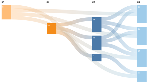
Hide Nulls

Have the ability to hide all nulls by hitting ‘disabled’. The image is showing how you can have flows from column 1 to column 4 with nulls in columns 2 & 3. Nodes can also start and end on different levels.

Sort Nodes by

Arrange the order of the nodes by name & value either ascending or descending. Name order can be very useful to have an easy to read Sankey Diagram, sorting by value may give you clearer insight to your measures. Automatic will use Sankey Diagrams internal algorithm which calculates the optimal order or nodes with the least link overlaps.

Sort Links by

Arrange the links by value. High to low or low to high. Ideal if you wish to show where most of your sales are going and to which category. Automatic will use Sankey Diagrams internal algorithm which calculates the optimal order or nodes with the least link overlaps.

Scale

Use the scale scroll bar when you have larger and more complex tables. This will reduce sizing of all nodes to allow your complex Sankey Diagram to fit to your dashboard.

Filter Type

When using Dashboard actions to filter, there is the option to filter based on just the selected node, or all connected nodes. Select the desired filter type and add a filter Dashboard action to apply the selected filter to your visualisations.

PreviousConfiguration ScreenNextColor formatting

Last updated 11 months ago