> For the complete documentation index, see [llms.txt](https://docs.infotopics.com/llms.txt). Markdown versions of documentation pages are available by appending `.md` to page URLs; this page is available as [Markdown](https://docs.infotopics.com/showmemore/features/venn-diagram.md).
# Venn diagram
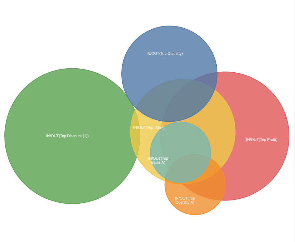
A Venn Diagram visually displays all possible logical relationships between sets, each typically shown as a circle. Each set contains a collection of items sharing a common property. When sets overlap, their intersection represents entities possessing qualities of all overlapping sets.
For example, consider a Venn Diagram with three sets: Top Profit, Quantity, and Sales.
* **Top Profit** represents items or entities that belong to the highest profit category.
* **Top Quantity** includes items that have a high quantity of units.
* **Top Sales** encompasses items with significant sales figures.
By examining the intersections:
* The area where **Top Profit** and Top **Quantity** overlap represents items that are both highly profitable and have a large quantity.
* The intersection of **Top Profit** and **Sales** includes items that are both highly profitable and generate significant sales.
* The overlap between **Quantity** and **Sales** indicates items that have a large quantity and high sales.
The center area where all three sets intersect shows items that are highly profitable, available in large quantities, and have significant sales figures.
Venn Diagrams are highly customizable follow one of the pages to customize specifics aspects of the diagram:
---
# Agent Instructions
This documentation is published with GitBook. GitBook is the documentation platform designed so that both humans and AI agents can read, navigate, and reason over technical content effectively. Learn more at gitbook.com.
## Querying This Documentation
If you need additional information that is not directly available in this page, you can query the documentation dynamically by asking a question.
Perform an HTTP GET request on the current page URL with the `ask` query parameter, and the optional `goal` query parameter:
```
GET https://docs.infotopics.com/showmemore/features/venn-diagram.md?ask=&goal=
```
`ask` is the immediate question: it should be specific, self-contained, and written in natural language.
`goal` is optional and describes the broader end goal you are ultimately trying to accomplish on behalf of the user. GitBook uses it to tailor the answer towards what is most useful for that goal.
The response will contain a direct answer to the question and relevant excerpts and sources from the documentation.
Use this mechanism when the answer is not explicitly present in the current page, you need clarification or additional context, or you want to retrieve related documentation sections.