ShowMeMore
WebsiteAll products
  • Introduction
    • Getting started with ShowMeMore
      • Guide to the first VizExtension
      • Getting started with dashboard extension
  • Visualization Types
  • Sankey Diagram
    • Data strucuture
    • Configuration Screen
    • Format
    • Color formatting
      • Text and background
      • Color Nodes
      • Color Links
    • Text formatting
      • Labels
      • Tooltips
      • Measures
    • Legend
    • Dashboard Actions
  • Source Target Sankey Diagram
    • Data strucuture
    • Configuration Screen
    • Format
    • Color formatting
      • Text and background
      • Color Nodes
      • Color Links
    • Text formatting
      • Labels
      • Tooltips
      • Measures
    • Dashboard Actions
  • Waterfall Chart
    • Data structure
    • Configuration Screen
    • Format
    • Labels
    • Measures
    • Color
    • Dashboard Actions
  • Geo Sankey Diagram
    • Data structure
    • Configuration Screen
    • Format
    • Tooltips
    • Labels
    • Dashboard Actions
    • Color
  • Network Diagram 2.0
    • Data structure
    • Configuration Screen
    • Analytics Options
    • Labels
    • Tooltip
    • Measures
    • Color
    • Format
    • Dashboard Actions
  • Radar Chart
    • Data structure
    • Configuration Screen
    • Format
    • Labels
    • Tooltips
    • Measures
    • Color
    • Legend
    • Dashboard Actions
  • Venn Diagram
    • Data structure
    • Configuration Screen
    • Format
    • Color
    • Labels
    • Tooltips
    • Measures
    • Legend
    • Dashboard Actions
  • Sunburst New Diagram
    • Data structure
    • Configuration Screen
    • Format
    • Tooltips
    • Measures
    • Labels
    • Color
    • Legend
    • Dashboard Actions
  • Sunburst diagram
    • Data structure
    • Configuration Screen
    • Format
    • Tooltips
    • Measures
    • Labels
    • Color
    • Legend
  • Chord Diagram
    • Data structure
    • Configuration Screen
    • Format
    • Color
    • Tooltips
    • Measures
    • Labels
    • Legend
    • Dashboard Actions
  • Circular Sankey Diagram
    • Data structure
    • Configuration Screen
    • Format
    • Tooltips
    • Measures
    • Labels
    • Dashboard Actions
    • Color
    • Legend
  • Ridgeline Plot
    • Data strucutre
    • Configuration Screen
    • Format
    • Color
    • Tooltips
    • Labels
    • Dashboard Actions
  • Horizon Chart
    • Data structure
    • Configuration Screen
    • Format
    • Labels
    • Color
    • Labels
  • Organization Chart
    • Data structure
    • Configuration Screen
    • Format
    • Color
    • Tooltips
    • Measures
    • Labels
    • Dashboard Actions
  • Calendar Chart
    • Configuration Screen
    • Labels
    • Measures
    • Color
    • Format
  • Network Diagram
  • Export Visualization
  • Troubleshot
    • Sankey Diagram crashes or fails to load
  • FAQ
    • Is the Waterfall Chart built directly from the data, or do I need custom calculations?
Powered by GitBook
On this page
  • How does it work?
  • Example Use Case

Geo Sankey Diagram

PreviousDashboard ActionsNextData structure

Last updated 11 months ago

A Sankey Diagram visualizes the proportional flow between variables (or nodes) within a network. It is an excellent tool to get insights into the major transfers of flows within a system. However, what if we can add geographical attributes to the Sankey Diagram and visualize the flows on top of a map? It gives unprecedented insights into your data. This is the question triggered the development process of the Geo-Sankey. The new ShowMeMore Geo-Sankey can provide you with a birds-eye view for better insights into your data.

How does it work?

The Geo-Sankey requires 6 dimensions and a measure. The measure shows the flow (value in the links) and the dimensions include source, target names and the coordinates. The width of the links and the radius of the nodes can be configured to represent the value.

Example Use Case

We have created an example use to demonstrate how you can use the Geo-Sankey. The large map on the left side of the screen is an instance of ShowMeMore with Geo-Sankey, on the right you have a bar chart with represents freight movement from different cities around the globe. The map above the bar chart shows country wise aggregated information of origin of freight movement.

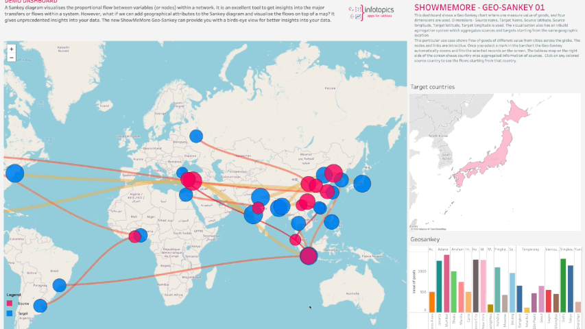
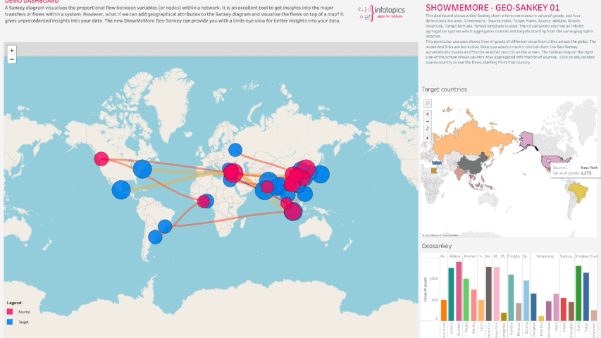
All the visualizations are interactive with the Geo-Sankey where you can click on a country to see the freight movements from that country to different destinations.

This way of data visualization, with Geo-Spatial attributes, helps you tell a story by curating data in an easy-to-understand way, by highlighting trends and outliers, thereby unlocking the hidden insights in the available data. The visual reports generated by Geo-Sankey can be extremely interactive and allow for easy investigation of stopgaps and concerns of the business.

Waterfall Charts are highly customizable follow one of the pages to customize specifics aspects of the diagram:

Configuration Screen
Tooltips
Dashboard Actions
Color
Format