
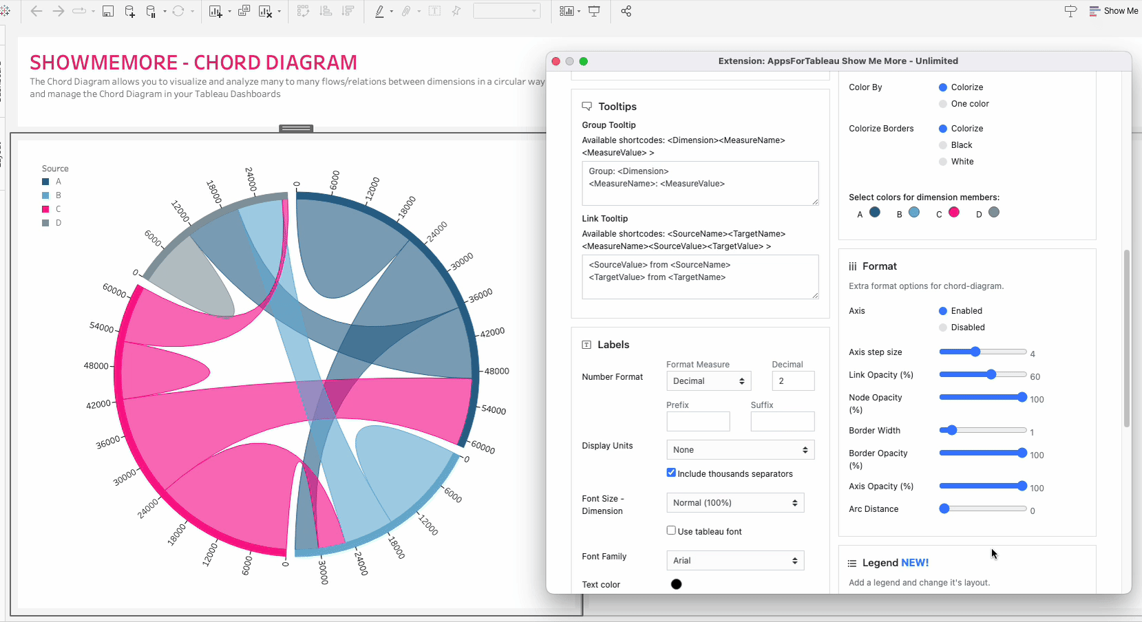
Color
Click the ‘Use new color formatting’ checkbox to use the new color options. This will allow you to color your dimensions, individually. When not using the new color formatting option, the Mark Colors will be colored by sorting order. This will allow you to customize your dashboard greatly!
Background color
Use the circle to open the color palette to change the background color of your Chord Diagram.
Color By
Choose between having one color throughout your diagram or to colorize using the color palette.
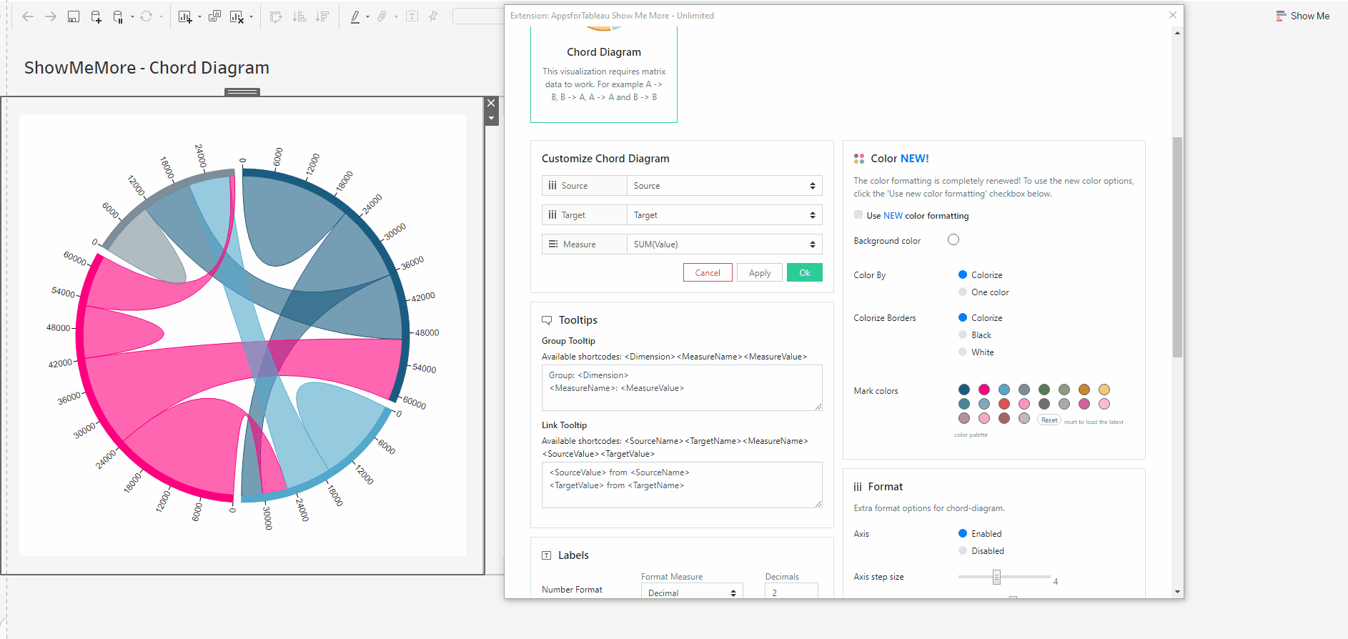
Colorize Borders
Edit the border in your Chord Diagram. Change the color of your borders by colorizing them using the color palette or making them black or white.
Mark Colors
Use the circles to open the color palette to change the colors of the marks. The order they are in will be the order of your levels.
Select colors for dimensions: (New color formatting only)
Click on the color palette that’s alongside your chosen dimensions to choose their color. This will ensure that the set/dimension you choose always has the same coloring in the dashboard
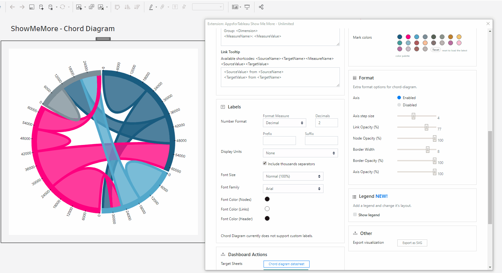
Format
Axis
Have an axis shown around your Chord Diagram. Format the labels of your axis below.
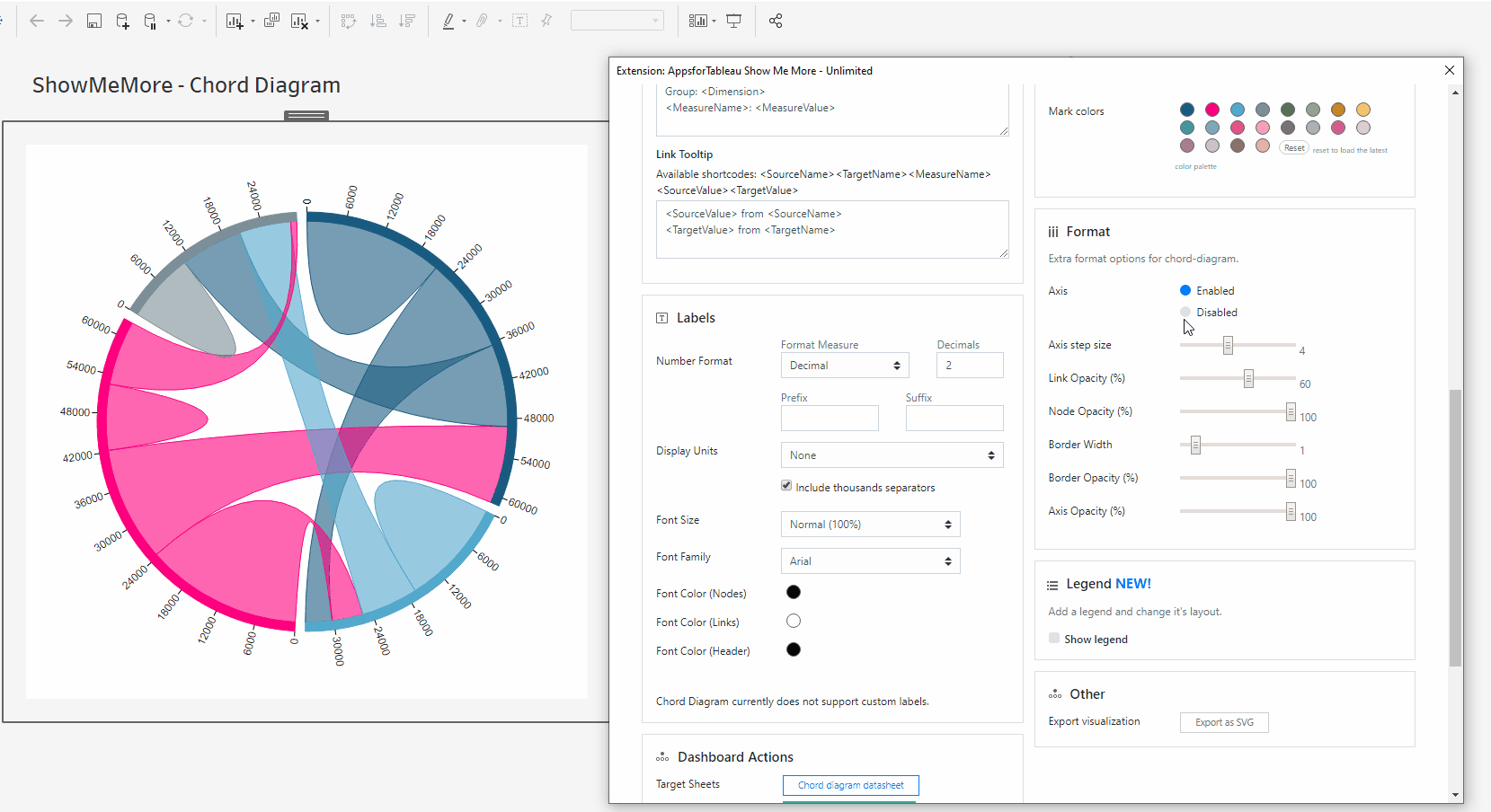
Axis Step Size
Decide how many steps of the axis you wish to be shown in your view. 0 will show no labels with 10 showing the most possible. No labels will overlap.
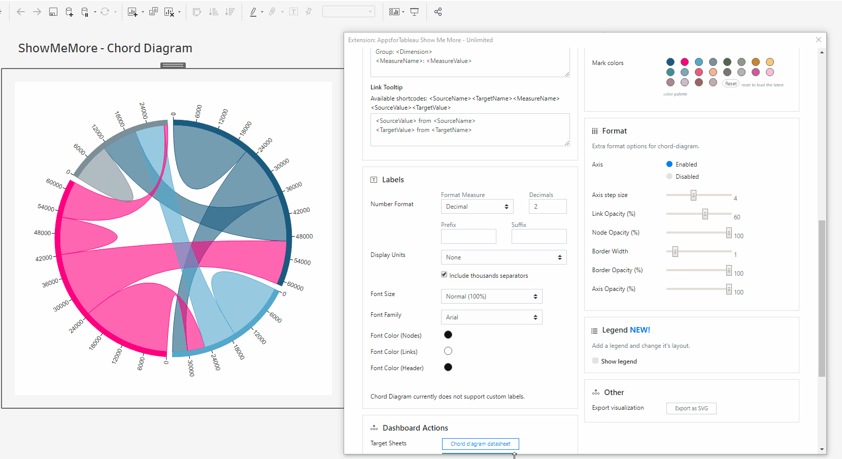
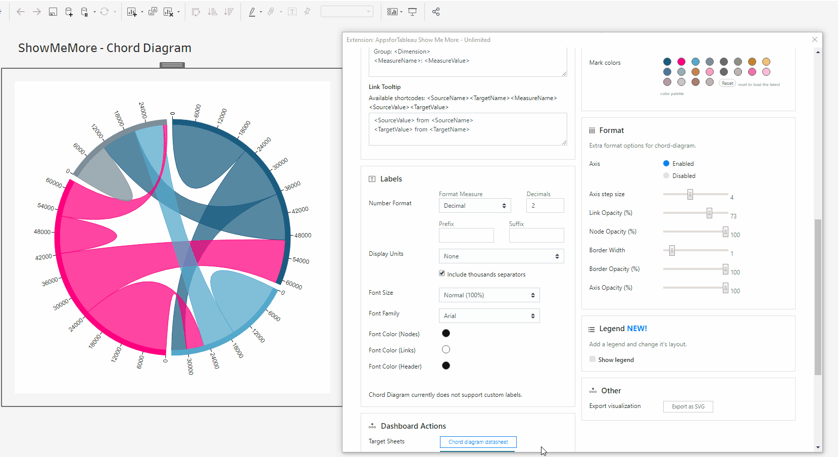
Link Opacity
Change the opacity of your links. 100 being full opacity, 0 being no opacity.
Node Opacity
Change the opacity of your nodes. 100 being full opacity, 0 being no opacity.

Border Width
Change the width of your border. 10 being the widest, 0 will show no border.

Border Opacity
Change the opacity of your border. 100 being full opacity, 0 being no opacity.
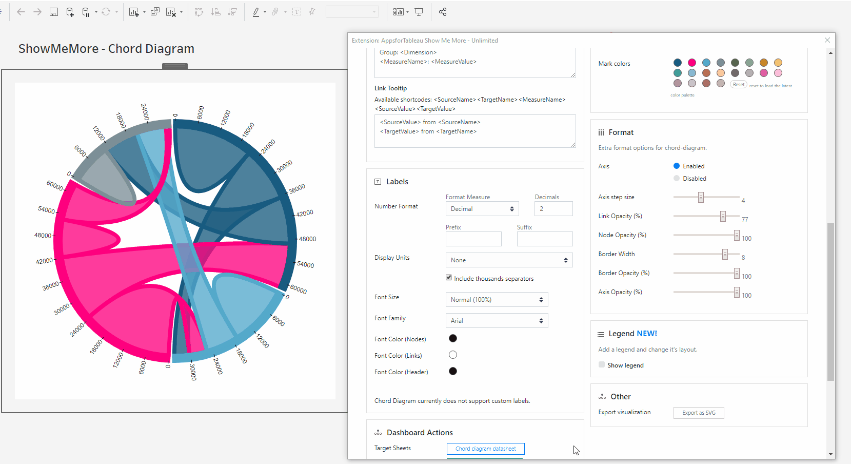
Axis Opacity
Change the opacity of your axis. 100 being full opacity, 0 being no opacity.
Arc Distance
Increase or decrease the space between all members on the outer circle.
Last updated