
Usage of the analytics pane
![]() – Reset Screen button. Zoomed out too much? Click here to reset your view.
– Reset Screen button. Zoomed out too much? Click here to reset your view.
![]() – Variants screen. A process variant is a unique path from the beginning to the end of the process. Click on a variant to filter your Process Mining viz (see Dashboard Actions tab to configure). What is your most frequent process and how many cases use this route? This could be a good candidate for your happy path! Sort your ‘Total Duration’ from longest to shortest to see which case(s) take the most time from start to finish, use the insight to streamline your process. Lastly see your ‘Total Waiting Time’, is the time acceptable? Fantastic insights, clearly visualized.
– Variants screen. A process variant is a unique path from the beginning to the end of the process. Click on a variant to filter your Process Mining viz (see Dashboard Actions tab to configure). What is your most frequent process and how many cases use this route? This could be a good candidate for your happy path! Sort your ‘Total Duration’ from longest to shortest to see which case(s) take the most time from start to finish, use the insight to streamline your process. Lastly see your ‘Total Waiting Time’, is the time acceptable? Fantastic insights, clearly visualized.

![]() – On a published dashboard your dashboard users can now easily export the process map to a PDF file. This allows dashboard users to integrate the process map in reports or to share with other people in the organization that have no access to the dashboards. Until Tableau Software supports the export of web elements and extensions to PDF files or Images on the server platform this is a much requested feature!
– On a published dashboard your dashboard users can now easily export the process map to a PDF file. This allows dashboard users to integrate the process map in reports or to share with other people in the organization that have no access to the dashboards. Until Tableau Software supports the export of web elements and extensions to PDF files or Images on the server platform this is a much requested feature!
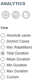
View
Animations


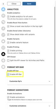
Analyzing using the KPI and KRI bar
Last updated
Was this helpful?