
Setup & Layout
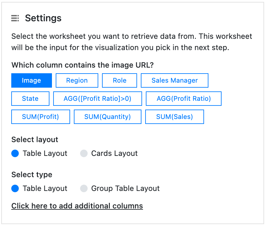
Which column contains the image URL?
Choose the column that contains the Image URL. This setting is crucial for the PictureThis extension. You can see the list of fields (dimensions and measures) that are available on the datasheet you selected in the previous step. Just select the dimension that holds the url to your image. This must be a “http://” or “https://” url that is free accessible and not password protected. The image must be of the format jpg, png or gif.
Select layout & Select Type
PictureThis offers 2 layouts: ‘Cards Layout’ and ‘Table Layout’. Both these layouts offer various variants. Below you will find the details about each layout
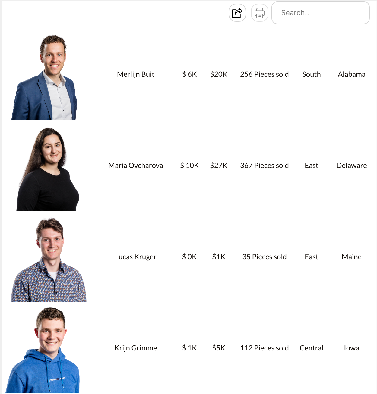
Card Layout
Cards layout will display an image grid where each card contains the image and other information. The simple card layout displays the information from other columns underneath the image. However, this can be modified in the configuration along with many more settings.
The Visualization

The Configuration

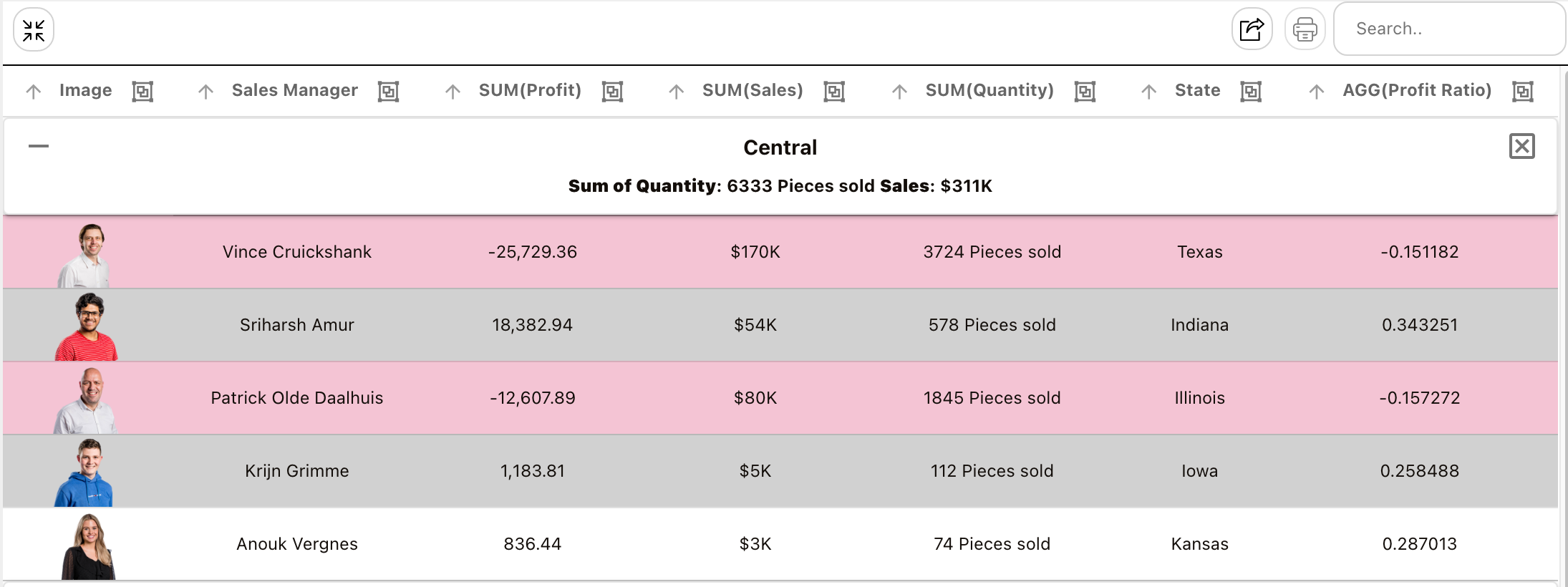
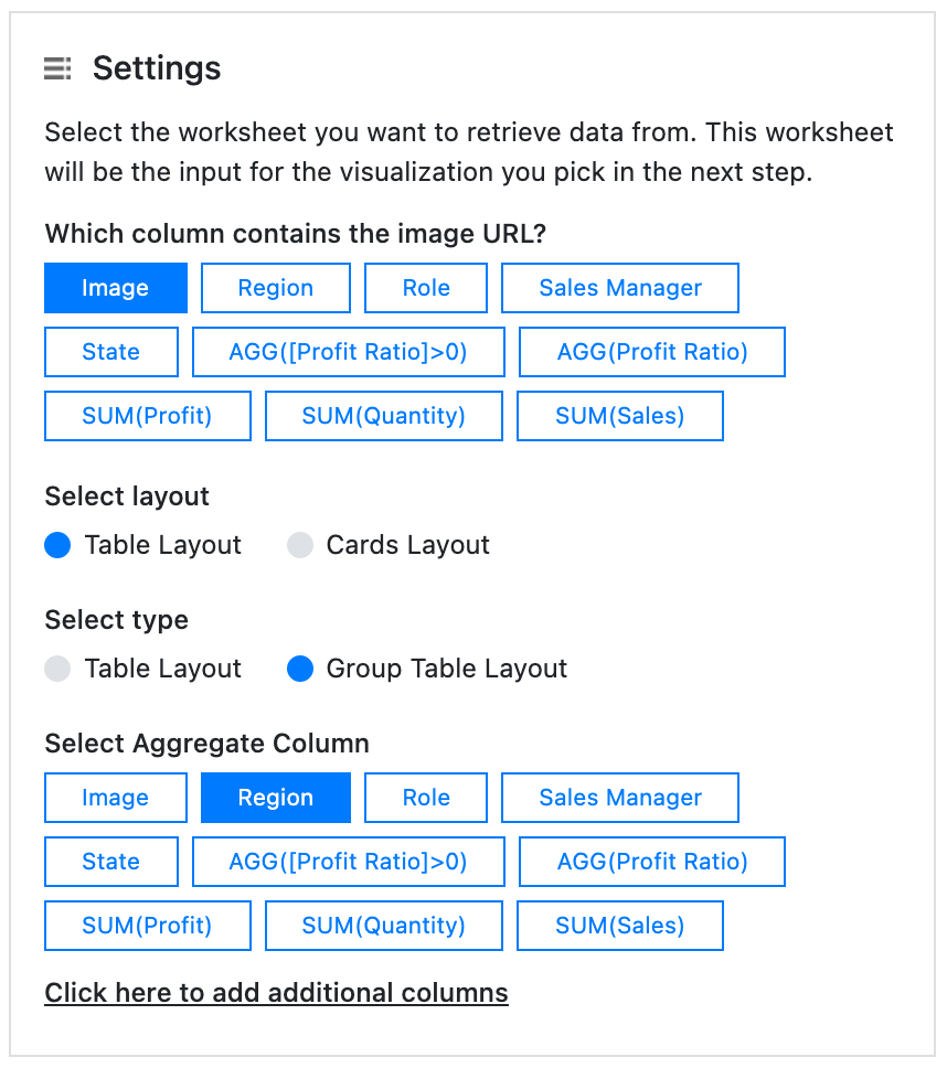
Grouped Table Layout
The Table layout with the “Group Table Layout” option enabled allows users to embed an interactive table while aggregating or grouping your data based on one of the dimensions. This feature is particularly useful for viewing individual rows while also having additional information about the aggregated rows in a single glance. The table can be used interactively to sort columns using the included buttons, making it a versatile tool for data analysis.
The Visualisation
The Configuration
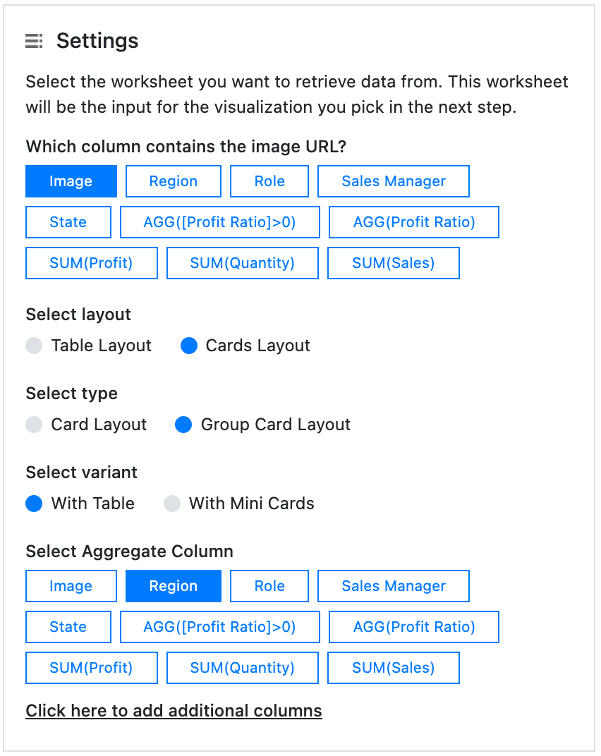
Group Card Layout With Table
When using the Cards layout you can also aggregate or group your data on dimension values. This allows you to display a “Summary Card” that can show extra properties of your grouped or aggregated data. The Summary Card comes with the “Group Card Layout” allowing users to display calculations on the aggregated/grouped rows. With the ability to show the sum or average of columns using the aggregated rows, this new card provides users with a more detailed and comprehensive view of their data, empowering them to make more informed decisions. In the below example we chose to show the aggregated/grouped data as a mini table.
The Visualisation

The Configuration
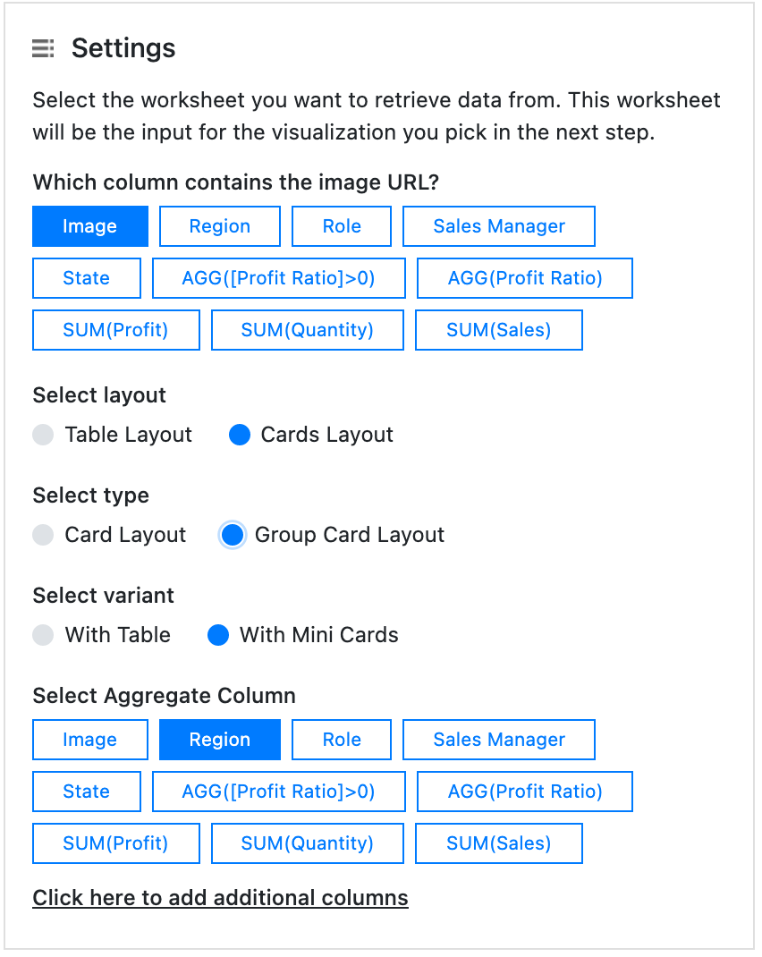
Group Card Layout With Mini Cards
The images of aggregated rows can be viewed as mini cards along or below the aggregated “Summary Card”. By clicking on the mini card, the details of that item can be viewed on the grouped card. This feature offers a simple and visually appealing way to explore row values, enhancing the user interface of your dashboards.
The Visualisation

The Configuration
Last updated