> For the complete documentation index, see [llms.txt](https://docs.infotopics.com/llms.txt). Markdown versions of documentation pages are available by appending `.md` to page URLs; this page is available as [Markdown](https://docs.infotopics.com/showmemore/features/waterfall-chart/format.md).
# Format
### Format aggregation and total
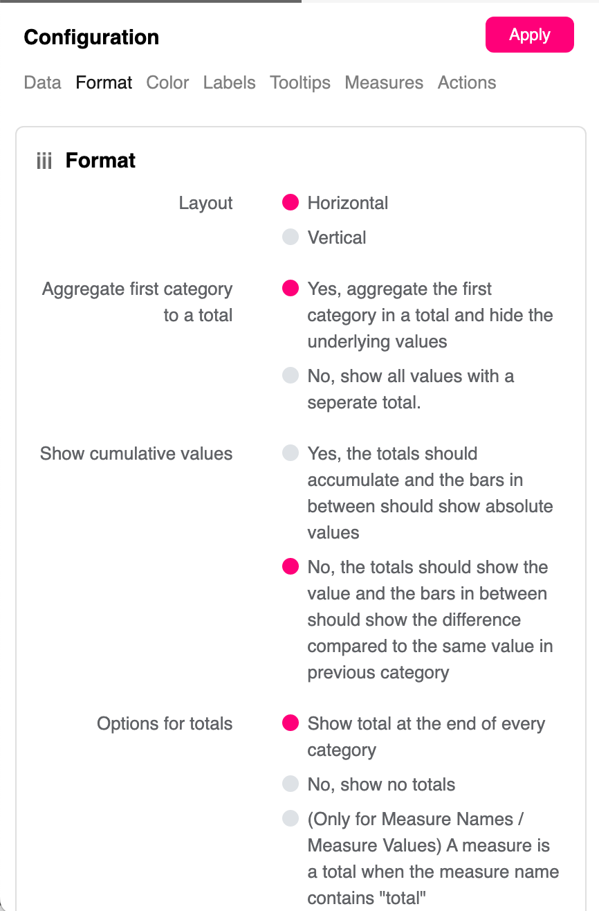
Waterfall Chart configuration panel -> Format
#### Aggregate first category to a total
Total your first category by aggregating. This will give you your starting point to run through the series. This could be the total of the previous years sales to then compare to the current year. If you want to just see the progressive sales from the start, show all values with a separate total.
#### Show cumulative values
Here you have the options to show cumulative values of your dimension through your series of dimensions or to compare the values in the series to the previous category. You may need insight over one series of which products or departments are performing well or may need to see how those performed compared to the series before. Both possible here.
#### Options for totals
Choose how totals are displayed in the Waterfall chart.
**Show total at the end of every category**\
Displays a total bar after each category in the Waterfall chart.
**No, show no totals**\
Hides all total bars from the Waterfall chart.
**Choose which categories show totals**\
Allows you to select specific categories where a total bar should be displayed.\
When this option is selected, the **Categories with totals** list appears. Select the categories that should include a total bar.
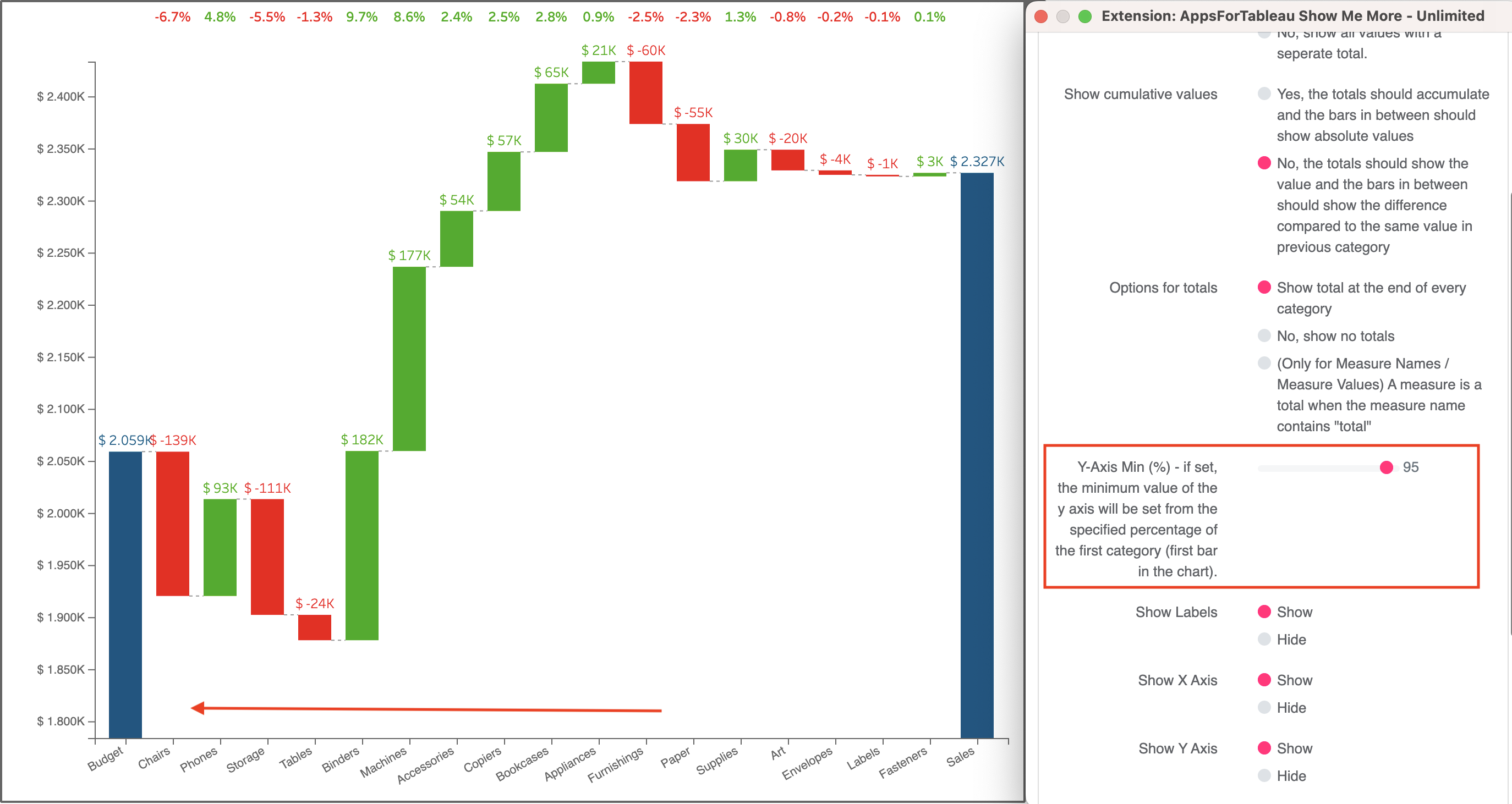
#### Y-Axis min (%)
Y-Axis Min (%) – if set, the minimum value of the y-axis will be set from the specified percentage of the first category (first bar in the chart).. Configuring the Y axis to start at your specified level will allow you to focus on each value of your Waterfall Chart.
#### Bar width
Use this setting to make the bars narrower or wider to improve readability and fit the chart layout.
#### Show labels/X-axis/Y-axis
Show or hide your measure labels in your viz. Turn off the X and Y axis too.
#### Show growth percentages
A very useful feature of the Waterfall Chart is the growth percentages shown at the top of each dimension. Each is This can be shown or hidden if you just want the bar charts to show you the differences.
#### Rotate X-axis label
Use the scroll bar to rotate the labels of your dimensions. Get your waterfall chart looking just how you want it.
#### X-axis & Y-axis spacing
Condense or spread out the waterfall chart for a clearer chart or to save that valuable dashboard space
---
# Agent Instructions
This documentation is published with GitBook. GitBook is the documentation platform designed so that both humans and AI agents can read, navigate, and reason over technical content effectively. Learn more at gitbook.com.
## Querying This Documentation
If you need additional information that is not directly available in this page, you can query the documentation by asking a question.
Perform an HTTP GET request on the following URL with the `ask` and `goal` query parameters:
```
GET https://docs.infotopics.com/showmemore/features/waterfall-chart/format.md?ask=&goal=
```
`ask` is the immediate question: it should be specific, self-contained, and written in natural language.
`goal` is what the user is ultimately trying to achieve, the reason they need the answer. Sharing it helps GitBook give you a better, more relevant answer. A goal is most helpful when it describes the outcome the user wants rather than restating the question. For example, with `ask=how do I create an API token`, a goal like `automate deployments from our CI pipeline` lets GitBook tailor the answer to that use case.
The response will contain a direct answer to the question and relevant excerpts and sources from the documentation.
Use this mechanism when the answer is not explicitly present in the current page, you need clarification or additional context, or you want to retrieve related documentation sections.